
by Cara Steinberg
Introduction
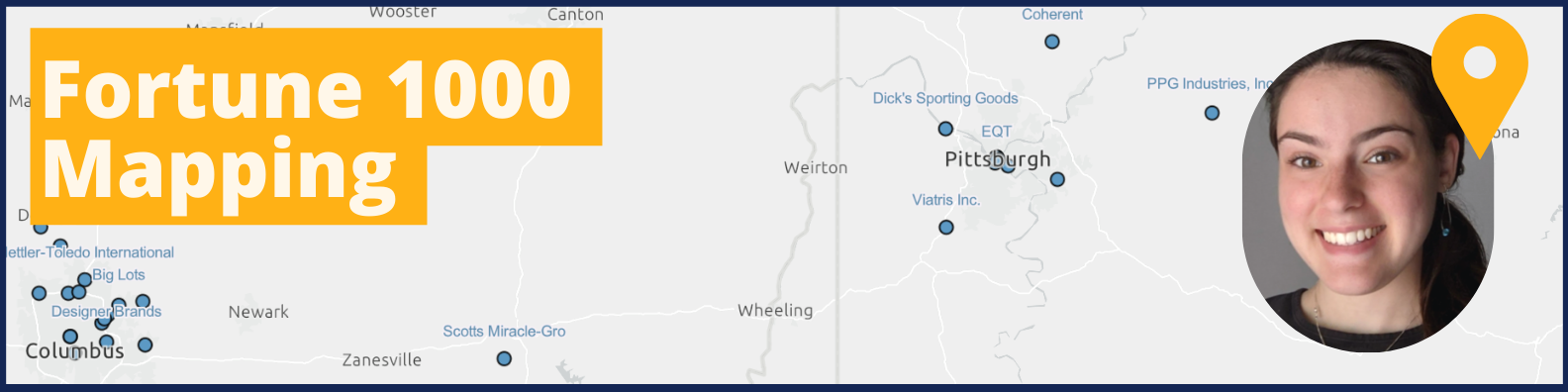
The “Fortune 1000 Mapping Project” combines the technicality of GIS and data visualization with actual corporate sustainability information. As an undergraduate student working to expand my career and hone skills within my passions, the Center for Sustainable Business (CSB) helped me to develop the most impactful project—for myself and the Center alike.
See the StoryMap version, interactive Tableau version, and/or more descriptive interactive Tableau version to explore the data directly yourself.
Significance
For the Center…
The Fortune 1000 Mapping Project serves the Center by helping to visualize and target companies in the surrounding area (Middle America) based on their sustainable progress and business standings. This is useful for the CSB to recruit fellows and engage new or current corporate stakeholders. The StoryMap and Tableau Dashboard show a visual distribution of sustainability efforts and corporate metrics. The map-based presentation accelerates the understanding and knowledge of Middle America’s corporate sustainability progress. Expanding and developing corporate sustainability knowledge is vital to facilitating corporate sustainability progress.
For myself (the intern)…
Personally, I decided to work on this project over winter break to use and develop my GIS/technological skills in a setting that catalyzes and furthers positive environmental and societal progress. My passion for sustainability is driven by the positive impact I can have: the opportunity to simultaneously develop my professional skills while assisting the CSB to drive corporate sustainability is meaningful to both me and the Center. My intersecting interests in environmental consulting and data visualization were vital to creating an effective and driving image of Middle America’s Fortune 1000 companies. The ability to visualize and present knowledge within an impactful medium and context showcases the importance of these businesses’ sustainability.

Reflection and Insights
Assembling the aspects of the Fortune 1000 Mapping Project required significant data collection. I researched and found a georeferenced dataset of 2022 Fortune 1000 companies, but no dataset that included their sustainability. The apparent absence of this data was surprising to me; Fortune 1000 companies are major leverage points within the scope of corporate sustainability. I was eager to make the connections between sustainability and business to further the center’s (and my own) education and awareness. My discovery of this data absence further cemented the importance and unique value that my project was going to bring to the table. So, I proceeded to pursue data collection for each company’s sustainable progress.
Following education and instruction from Chris Gassman, I collected data on all 105 companies’ sustainability from reputable sustainability sources including the Science Based Target Initiative, IFRS Sustainability Alliance, and Carbon Disclosure Project. The purpose of selecting these specific sustainability metrics was to standardize the comparison among Fortune 1000 companies. On an analytical level, it is neither valid nor accurate to compare sustainability efforts of differing standards, metrics, and baselines among companies. I considered adding specific information from all the companies’ websites, but this perspective on sustainability is at great risk of greenwashing. This data would not be usable in an objective presentation of information for the project’s visualizations.
I was quickly drawn to ArcGIS Online (AGOL) StoryMap software and later Tableau Public to visualize the narrative of Middle America’s Fortune 1000 Sustainability. Maps tell a story and present information through the creator’s vision. My vision centered the maps and secondarily supported them with text. I found the StoryMap software showcased both my map and allowed me to share the vital context of the metrics I chose to present. In writing this context, I was able to cite my sources and provide resources and links where the content was scarce/unclear. I also headed each section with the research question that the map answered. In doing so, the viewer can ensure their interpretation of the visual is consistent with the research question I intended to visualize. Overall, the textual content of the story is imperative to ensuring the viewer’s understanding of the presented data and the story of Fortune 1000 companies in Middle America.
Additionally, the interactive nature of Tableau served the flexibility of the dataset I assembled. The StoryMap shows all the information, but the dashboard allows the viewer to interact with and understand the data in unique combinations that they can only imagine. The filterable aspect of the Tableau dashboard allows a more focused view, whether that be by sector, female CEOs, or even profit. Through this visualization, the viewer can explore the knowledge to be gained from the dataset through their own control.
A major reason that I enjoy GIS and data visualization is the artistic and aesthetic aspect of creation. Selecting the color palette, base map, and branding of the entire StoryMap and Tableau dashboard was a creative process. I worked through this process of trial and error until the product was both visually pleasing and impactful. I am also mindful of inclusivity when creating visualizations: my initial version of the map used a red and green color scheme. I made adjustments to a colorblind-friendly blue and orange palette to ensure understanding for all viewers.
Conclusion
The Fortune 1000 Mapping Project was an important experience for myself and the Center. As an evolving student and environmentalist, I was able to employ my skills and passions to create an impactful and useful resource for the CSB to draw on. The transition from the classroom to working-world skills and their application is an invaluable opportunity. I developed technical and professional skills with integrity and gained experience to draw on in future career opportunities. Additionally, the Center gained from my project; the CSB now has a visual and interactive resource for progressing and developing Middle America’s sustainability knowledge and stakeholder engagement.
Possible Future Steps
Future iterations on this map could include further sustainable business datapoints. For example, data from the CDP that did not make the scope of the initial project (e.g. Scopes 1-3 emissions numbers, any internal Carbon Price, etc.). Another example would be to expand the number of Middle America States reviewed for Fortune 1000 headquarters.